
How to Get Exact Color in Product Photography with a Color Chart
- 27 de dez. de 2016
- 2 min de leitura

It's happened to me and it has most likely happened to you: you order a shirt and can't wait for it to arrive. Then it does and it's a completely different hue than what was pictured in the online store or catalog. Odds are the photographer may not have used a color chart during his or her shoot. There are many photographers that never learn to use a color chart at all, and others who won't do a shoot without one. Here are a few major points on how a color chart can help make your product photography color spot on.
Influencing Light in Your Studio Space
I think an important question to ask yourself is, where are you shooting? What are the variables in the space you are shooting that can throw off your white balance? If you're out in a forest shooting adorable family photos while the sun sets behind them, then you're probably ok to let this one slide. Where the true help comes in, is on a set or as a product photographer. Many times in studios there can be other light influences causing even the slightest temperature differences to be seen in your final images. Having your color chart in your first frame you can grab the color you want by first selecting your white balance and then the rest fo the images will follow suit. Yes if you are shooting products outdoors you're going to want to use a color chart as well!
What Are You Shooting?
For photographers who shoot products, this little sucker can really help you deliver the right color to your clients. Take garments for example; If you are hired to shoot a women's lingerie catalog, your client will want the color to be true to the actual pieces that will be received by their clients. Your little color chart will help you get this right in your raw images. A good color chart to use and a great bargain is the X-Rite Color Checker it also comes with a grey scale card and works for video as well!
Keeping Your Color On Point With Different Gear
Every camera body and lens throws out different color temperature, sometimes very subtle and sometimes not so much. I shoot on a Canon 5D Mark III and see great differences when switching from lens to lens. While some are lenses like my all time favorite, the Canon EF 50mm f/1.2L, produces images that are quite warm, others can be much cooler. This can be a little frustrating when your in post and trying to get your subjects wardrobe or skin tone to match through out your session. If you bring along your color chart, you'll see a world of difference next time your in post.
Setting Camera Profiles
For those times where maybe you weren't expecting to need your color chart having a preset profile can help! Set up a general profile that matches typical lighting situations and you can adjust later in Lightroom. Note, this applies to outdoor situations.
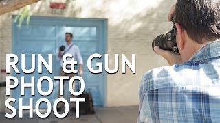
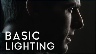
Here is an easy to watch video from The Slanted Lens about how to use the chart and why you need it.
Lead Image used with permission by David Mecey.
From :fstoppers.com


Comentários